
State Scoreboard August: The Healthcare Map
Which states have built healthcare systems that work, and which ones leave people carrying the cost?

Your ZIP code should not determine whether you can afford to see a doctor, get preventive care before a crisis, or survive an illness that should have been treatable.
But in America, state lines shape all of that.
For Day 3 of State Scoreboard August, we’re looking at healthcare: which states have health systems that perform best overall, which are falling behind, and what those rankings tell us about the systems people are forced to live inside.
This is not a judgment on the people in any state. It is a look at whether the institutions around them are making healthcare accessible, affordable, effective, and equitable.
How this healthcare scoreboard works
For this part of the series, I’m using the Commonwealth Fund’s 2025 Scorecard on State Health System Performance.
The scorecard compares all 50 states and Washington, D.C. using 50 measures of health-system performance. It looks at several areas that affect whether people can actually get and use healthcare:
Access and affordability: insurance coverage, cost barriers, and whether people can get the care they need.
Prevention and treatment: preventive services, chronic-care management, behavioral healthcare, and treatment quality.
Avoidable hospital use and costs: emergency-room use, preventable hospitalizations, readmissions, and unnecessary spending.
Healthy lives and health outcomes: premature death, infant mortality, preventable illness, and other measures of how long and how well people live.
Equity: whether health outcomes and access differ by income, race, ethnicity, or other structural factors.
That last part matters.
A state can look decent on average while still leaving certain communities behind. So this is not a simple “best doctors” ranking. It is a broader report card on whether a state health system works for its people.
Like the education and economy maps, this is a composite index. Different methods could move some states around. But the Commonwealth Fund’s approach is useful because it includes access, outcomes, costs, and equity rather than treating healthcare like a luxury product for people who can already afford it.
The Top 10 healthcare systems
Here are the Top 10 states in this 50-state healthcare comparison:
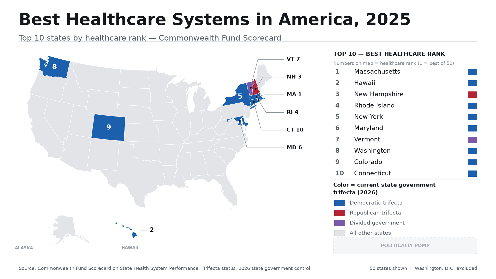
Map note: Colors show current 2026 state-government control. Rankings measure healthcare-system performance, not the worth or effort of the people living in any state.
The Commonwealth Fund’s national report identifies Massachusetts, Hawaii, New Hampshire, and Rhode Island among its highest-performing states; Washington, D.C. also ranks near the top but is not included in this 50-state series.
There are patterns here worth noticing.
A number of these states also appeared near the top of the education and economy maps: Massachusetts, Washington, Colorado, New Hampshire, and Connecticut. That does not mean one ranking magically causes another. It means public systems tend to overlap. A stronger tax base, a more educated workforce, broader insurance coverage, and sustained institutional investment can reinforce each other.
Still, “top-ranked” does not mean perfect.
Massachusetts can lead the country in overall system performance and still have residents struggling with costs, uneven provider access, or racial and geographic disparities. A high rank is not permission for leaders to stop improving. It is evidence that the system has built more capacity than most.
In the map graphic, these states are colored by their current state-government trifecta status: blue for Democratic trifectas, red for Republican trifectas, and purple/gray for divided government. That context matters, but it is not a shortcut to causation. We’ll look more closely at long-term governance later in the month.
The Bottom 10 healthcare systems
Now for the harder half of the map.
Here are the Bottom 10 states in this 50-state healthcare comparison:
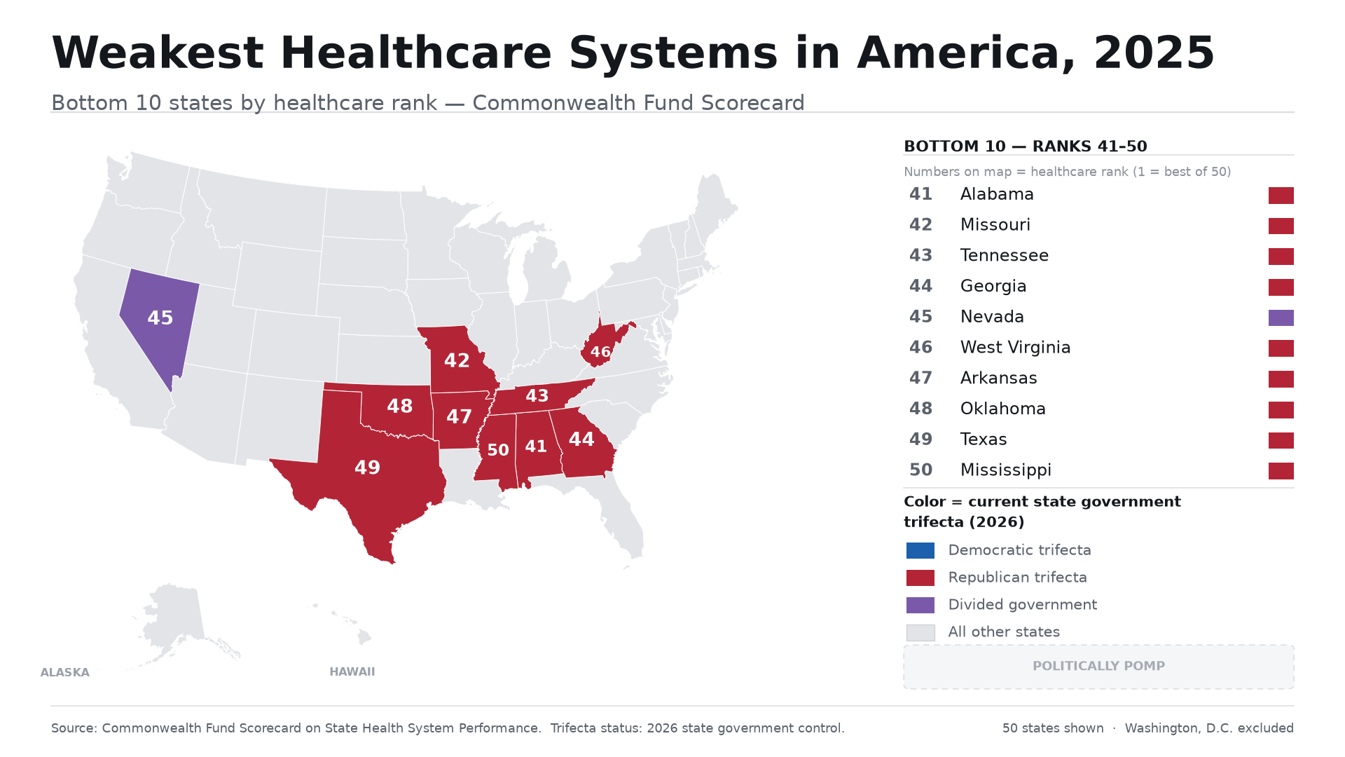
Map note: Colors show current 2026 state-government control. Rankings measure healthcare-system performance, not the worth or effort of the people living in any state.
The Commonwealth Fund’s own Bottom 5 are Mississippi, Texas, Oklahoma, Arkansas, and West Virginia.
Again, this is not about blaming people who live in these states. It is not about whether people work hard, love their families, or care for their neighbors.
It is about systems.
If you live in a state where you cannot afford insurance, where a rural hospital closes, where an ambulance ride can create a financial crisis, or where your nearest specialist is hours away, that is not a personal failure. It is a policy failure.
And it is not lost on me that several of these states have already appeared at the bottom of our education and economy scoreboards: West Virginia, Mississippi, Arkansas, Oklahoma, Texas, and Alabama.
When the same states keep showing up at the bottom across multiple systems, we cannot keep pretending each issue is isolated. People do not experience education in one compartment, jobs in another, and healthcare in another. They experience one life inside a set of systems that either support them or make every step harder.
What this tells us, and what it doesn’t
Healthcare rankings can be tempting to oversimplify, so I want to be careful here.
A low-ranked state is not a state without good doctors, nurses, EMTs, hospital staff, therapists, advocates, or people doing heroic work under pressure. Some of the most committed healthcare workers in the country are holding together systems that have failed to give them enough resources.
Likewise, a high-ranked state is not free of medical debt, racial disparities, long wait lists, insurance denials, or corporate influence.
The question is not: “Is healthcare perfect in this state?”
The question is: Compared with the rest of the country, how well has this state built a system that gives ordinary people a fair shot at getting and staying healthy?
That is a more honest question. And honestly, it should be one we ask every person asking for power.
Because healthcare is not just a lifestyle issue. It is about whether a parent delays a doctor visit because of the bill. Whether a pregnant person can get care close to home. Whether a child receives treatment before an illness gets worse. Whether an older adult can afford prescriptions. Whether a family has to choose between rent and an emergency-room visit.
Those are policy outcomes. They are the lived consequences of decisions made by people with power.
The pattern is getting harder to ignore
We are only three issues into State Scoreboard August, but the overlap is already becoming clear.
States that show up near the top in education and economic strength often show up near the top in healthcare performance, too. States at the bottom of education and economic rankings often appear again at the bottom of healthcare.
That does not mean every state has the same story. It does not mean party labels alone explain every outcome. Geography, demographics, population density, federal policy, historic inequities, and local decision-making all matter.
But “it’s complicated” cannot become an excuse to avoid accountability.
If a state has been governed by the same party, the same legislative coalition, or the same political priorities for years, while people keep struggling to access doctors, afford medication, or survive preventable illness, then we have to ask whether that system is producing what it promised.
Where we’re going next
Next, we’ll step into a different kind of ranking: happiness.
That may sound softer than healthcare, education, or the economy. But it opens an important question: what does it mean for people to feel well in the place they live? And how do happiness rankings compare with the systems that are supposed to make life livable?
Later this month, we’ll continue stacking these maps:
Which states appear near the top across education, economy, and healthcare.
Which states keep appearing near the bottom.
Who has held power in those places over the last 20 years.
How federal money flows into and out of those same systems.
The goal is not to shame communities. It is to name patterns, ask better questions, and remember that people deserve more than political slogans when their health is on the line.
Your turn
Where does your state land on the healthcare map?
Tell me in the comments: what has healthcare looked like where you live? Affordable? Impossible? Easy to access? A months-long wait? A rural hospital closing? A fight with insurance?
I want this series to make room for the numbers and the people living behind them.
If this is the kind of political breakdown you want more of, keep following along. We’re just getting started breaking down the systems.